1 Apr
2017
1 Apr
'17
10:10 a.m.
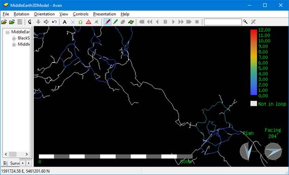
The new capability of exporting loop closure information to 3d format is helping to identify the bad loops on our surveys. Very nice. However the scalebar at the top right seems to be locked into a range of 0.0 to 12.0 (%) error. This is OK for our really nasty loop closures; the maps look suitably colourful, but some of our more recent cave surveys don't have error much more than 1.5%, so the picture is kind of shades of blue, as below. It doesn't help with visualising the relative quality of the loops. Would it be possible to change the default scalebar to something like 0.0 to 2.0, with the upper limit stepping upwards to suit the data, if there are larger loop errors? Bruce