Colour legend labels poorly aligned if more than single line

The alignment of labels is set towards the top of the colour swatch for the colour legend. This is probably perfect for the banded colour lookup shown below. However where there are multiline labels, the first line for each swatch is set too high. May I suggest that the insertion point/alignment for each text label be set at the top of each swatch, rather than above the centre of each swatch as currently appears to be the case? Bruce lookup altitude:FloodLower -title "Passage coloured by Inundation Hazard" #these colours work best with higher opacity (70-100) [430 500] [098 100 098] [Above 430 m inundation not observed] #greeny white [420 430] [086 100 100] [430 m - 10 yr return period<br> 90 cumec, Riuwaka at Littles] #water blue [400 420] [043 060 090] [420 m - 5 yr return period<br>70 cumec, Riuwaka at Littles] [300 400] [000 020 080] [400 m frequent flooding assumed] #dark blue endlookup
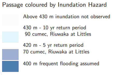
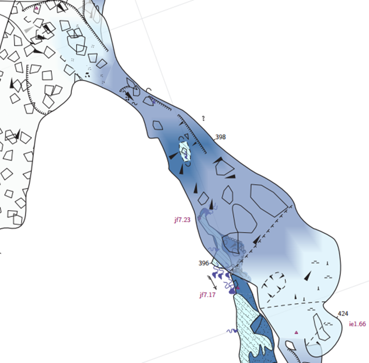

Hi, you can check the latest commit which should fix the issue. On the other hand, please also check that regular labels using <br> are not affected by this change. Cheers Martin On Tue, Aug 17, 2021 at 10:36 AM Bruce Mutton <bruce@tomo.co.nz> wrote:
The alignment of labels is set towards the top of the colour swatch for the colour legend. This is probably perfect for the banded colour lookup shown below.
However where there are multiline labels, the first line for each swatch is set too high.
May I suggest that the insertion point/alignment for each text label be set at the top of each swatch, rather than above the centre of each swatch as currently appears to be the case?
Bruce
lookup altitude:FloodLower -title "Passage coloured by Inundation Hazard"
#these colours work best with higher opacity (70-100)
[430 500] [098 100 098] [Above 430 m inundation not observed] #greeny white
[420 430] [086 100 100] [430 m - 10 yr return period<br> 90 cumec, Riuwaka at Littles] #water blue
[400 420] [043 060 090] [420 m - 5 yr return period<br>70 cumec, Riuwaka at Littles]
[300 400] [000 020 080] [400 m frequent flooding assumed] #dark blue
endlookup
_______________________________________________ Therion mailing list Therion@speleo.sk https://mailman.speleo.sk/listinfo/therion
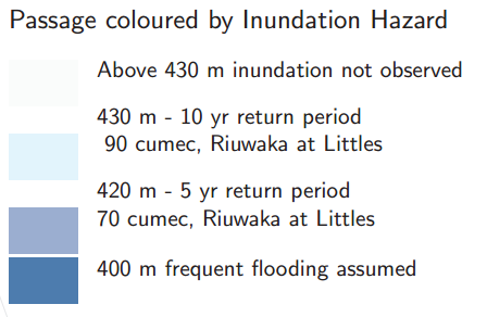
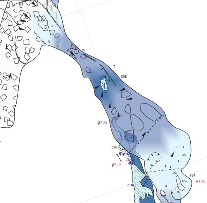
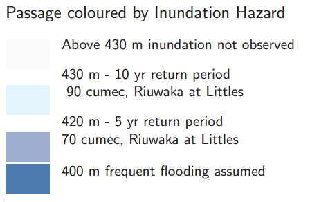
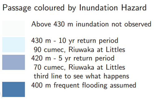
Thanks Martin The colour legend looks much better, including when three lines are included for one entry. The relative position of map header title is changed relative to the north arrow – probably not ideal as it will change existing projects. This is the new position with 48180cb This is what it was like. I think point labels are unaffected. Forcing the symbol legend to fit in too narrow a space gives an acceptable result. I have not tried an explicit newline <br> but expect it would give a similar result. All up a good change, but it may upset some header title positions. Bruce From: Therion <therion-bounces@speleo.sk> On Behalf Of Martin Budaj Sent: Thursday, 19 August 2021 07:26 To: List for Therion users <therion@speleo.sk> Subject: Re: [Therion] Colour legend labels poorly aligned if more than single line Hi, you can check the latest commit which should fix the issue. On the other hand, please also check that regular labels using <br> are not affected by this change. Cheers Martin On Tue, Aug 17, 2021 at 10:36 AM Bruce Mutton <bruce@tomo.co.nz <mailto:bruce@tomo.co.nz> > wrote: The alignment of labels is set towards the top of the colour swatch for the colour legend. This is probably perfect for the banded colour lookup shown below. However where there are multiline labels, the first line for each swatch is set too high. May I suggest that the insertion point/alignment for each text label be set at the top of each swatch, rather than above the centre of each swatch as currently appears to be the case? Bruce lookup altitude:FloodLower -title "Passage coloured by Inundation Hazard" #these colours work best with higher opacity (70-100) [430 500] [098 100 098] [Above 430 m inundation not observed] #greeny white [420 430] [086 100 100] [430 m - 10 yr return period<br> 90 cumec, Riuwaka at Littles] #water blue [400 420] [043 060 090] [420 m - 5 yr return period<br>70 cumec, Riuwaka at Littles] [300 400] [000 020 080] [400 m frequent flooding assumed] #dark blue endlookup _______________________________________________ Therion mailing list Therion@speleo.sk <mailto:Therion@speleo.sk> https://mailman.speleo.sk/listinfo/therion
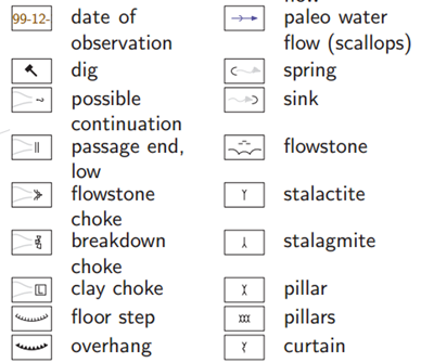
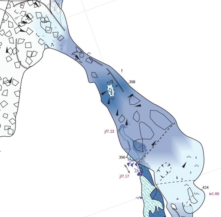
On Thu, Aug 19, 2021 at 10:59 AM Bruce Mutton <bruce@tomo.co.nz> wrote:
The relative position of map header title is changed relative to the north arrow – probably not ideal as it will change existing projects.
Hi, this should be fixed in af88db0 <https://github.com/therion/therion/commit/af88db0d411fb7c8bc9f910bec251346e7546455>. But there was another bug in the map header title, where line spacing of a long title broken to multiple lines (without using <br>) was too tight. I've fixed that, too, but this will definitely change the appearance of long map titles.
Forcing the symbol legend to fit in too narrow a space gives an acceptable result.
I have not tried an explicit newline <br> but expect it would give a similar result.
Not really, any text containing <br> is converted to a TeX table and thus processed very differently. Cheers Martin
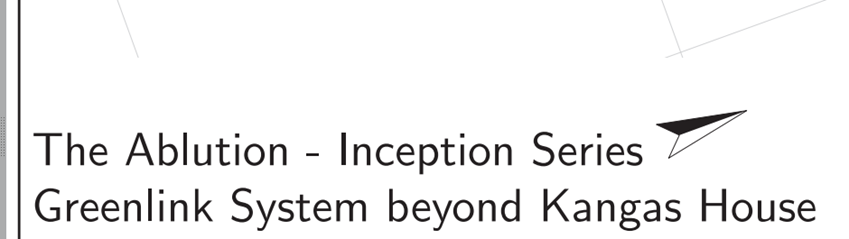
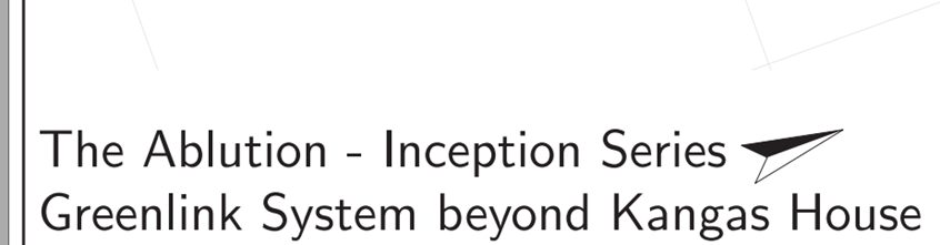
Thanks Martin map header title Version af88db0 <https://github.com/therion/therion/commit/af88db0d411fb7c8bc9f910bec251346e7546455> does seem to be better. As I have customised my map-tex quite a bit, I had to manually transcribe the changes, so my testing may be biased. I tried removing the manual break from my long map name, and spacing looks good. The text over writes the north arrow, although that is consistent with what happened before (possible that this is an artifact of my customisation however). Something that is happening with map header title that does not happen with automatic line breaks elsewhere is a heavy black | character. I recall something like this was an issue long ago. Is it a newline character rendering inappropriately? I’m not particularly concerned about the text overwriting the north arrow, but the newline character is undesirable. Without break With break Break in legend text I added a break to the clay, mud legend, and so although it is processed differently, the effect is the same or very similar to overlength text that is forced to wrap. . Bruce From: Therion <therion-bounces@speleo.sk> On Behalf Of Martin Budaj Sent: Saturday, 21 August 2021 06:31 To: List for Therion users <therion@speleo.sk> Subject: Re: [Therion] Colour legend labels poorly aligned if more than single line On Thu, Aug 19, 2021 at 10:59 AM Bruce Mutton <bruce@tomo.co.nz <mailto:bruce@tomo.co.nz> > wrote: The relative position of map header title is changed relative to the north arrow – probably not ideal as it will change existing projects. Hi, this should be fixed in af88db0 <https://github.com/therion/therion/commit/af88db0d411fb7c8bc9f910bec251346e7546455> . But there was another bug in the map header title, where line spacing of a long title broken to multiple lines (without using <br>) was too tight. I've fixed that, too, but this will definitely change the appearance of long map titles. Forcing the symbol legend to fit in too narrow a space gives an acceptable result. I have not tried an explicit newline <br> but expect it would give a similar result. Not really, any text containing <br> is converted to a TeX table and thus processed very differently. Cheers Martin


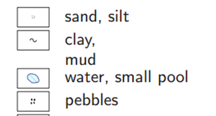
On Sat, Aug 21, 2021 at 12:50 AM Bruce Mutton <bruce@tomo.co.nz> wrote:
*map header title*
The text over writes the north arrow, although that is consistent with what happened before (possible that this is an artifact of my customisation however).
Thanks Bruce for testing the modifications. Collision with the north arrow was present all the time; it's fixed in the latest commit.
Something that is happening with map header title that does not happen with automatic line breaks elsewhere is a heavy black | character. I recall something like this was an issue long ago. Is it a newline character rendering inappropriately?
This is a TeX way to mark overfull lines. It can be switched off, but it's good to have it activated to point you to problematic line breaks. But now it should show up much more rarely, as the recent commit uses left instead of block justification for the map title, which allows for more flexible line breaks. M.
Thanks again Martin I transcribed the af88db0 <https://github.com/therion/therion/commit/75c7d3f9e2de37c5e85ecc0513087bc68b78a2b8> changes to my custom header, also off my customisations just to make sure. I can confirm that af88db0 <https://github.com/therion/therion/commit/75c7d3f9e2de37c5e85ecc0513087bc68b78a2b8> does indeed solve the problem. If the user takes control and adds a break, this perhaps gives the best result so long as the user makes a wise choice. If the user just enters a long unbroken string, then the north arrow width is blocked out for all lines required to display the entire title. So my conclusion – If there are no breaks in the cavename string, the map title will avoid the north arrow. If there are breaks, the cavename string is allowed to clash as it is assumed the user is making a deliberate choice. Nice. With break after ‘Series’ With break after ‘Greenlink’ Without break I didn’t check the minor map-comment formatting change to the header and the atlastitlepages. Seems like minor detail :) Bruce From: Therion <therion-bounces@speleo.sk> On Behalf Of Martin Budaj Sent: Sunday, 22 August 2021 04:24 To: List for Therion users <therion@speleo.sk> Subject: Re: [Therion] Colour legend labels poorly aligned if more than single line On Sat, Aug 21, 2021 at 12:50 AM Bruce Mutton <bruce@tomo.co.nz <mailto:bruce@tomo.co.nz> > wrote: map header title The text over writes the north arrow, although that is consistent with what happened before (possible that this is an artifact of my customisation however). Thanks Bruce for testing the modifications. Collision with the north arrow was present all the time; it's fixed in the latest commit. Something that is happening with map header title that does not happen with automatic line breaks elsewhere is a heavy black | character. I recall something like this was an issue long ago. Is it a newline character rendering inappropriately? This is a TeX way to mark overfull lines. It can be switched off, but it's good to have it activated to point you to problematic line breaks. But now it should show up much more rarely, as the recent commit uses left instead of block justification for the map title, which allows for more flexible line breaks. M.


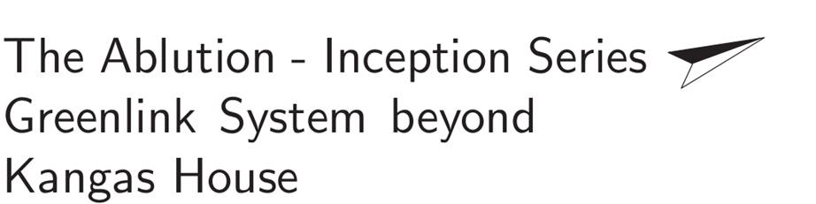
participants (2)
-
 Bruce Mutton
-
 Martin Budaj